So you created your art design in Adobe Illustrator, so it should be vector art, ready to print on a t-shirt….right? Unfortunately, in most cases the answer is no. Here at Garment Graphics we want to make your order process as simple and easy as possible. Here are some tips to help you or your artist get your awesome design ready for printing.
Tip 3: Convert all CMYK or RGB into Spot ColorScreen printers appreciate it when an artist sends a file that is already put into spot color. This cuts down the time having to recolor from CMYK or RGB and most importantly help save your effects such as lenses, meshes, gradients etc. the way you want them.
When a color is a spot color, the swatch in the Swatches palette will have a unique appearance.
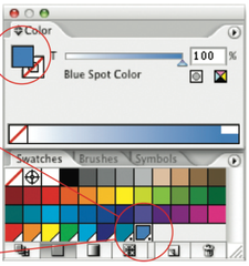

You can easily convert process colors to screen-print friendly spot colors. Double-click any process color swatch in the Swatches palette. It will open the Swatch Options window.
Change the Color Type from Process to Spot Color. You can rename your swatch, too.
You can also import a swatch library of spot colors such as a PANTONE solid coated. To add Pantone colors, choose Window>Swatch Libraries>Color Books>. In the pop-up menu select the PANTONE solid coated option.
Tip 4: Halftones/Gradients
Halftones are dots that are used to create the effect of a gradient or color fading. The easiest way to deal with halftones/gradients is to first, think of the background they are going on. If the garment is black and you print yellow halftones, the background will make that halftone yellow appear as a darker yellow, not a lighter one. Imagine printing your design on black paper, this will help you envision what the design would look like on the garment. 
Also, remember, halftones can have a really nice affect, but shouldn’t be used in highly detailed, small areas of your design. The halftone dots can only be printed so small and will not have the affect you are looking for.
Final Note
Your artwork will probably be output on a different hardware and software configuration to yours; the more complex your artwork, the greater the possibility of errors during output.
There is one more area to pay attention to before sending your file to the screen printer. Go over the art in the layers palette and make sure there are no hidden layers that could possibly be printed. When a file is opened in a different program than originally created in sometimes the hidden layer will cause problems. To give your screen printer and easier file to work with, make a copy of your art and save that file with only layers being used, and delete all the hidden ones. This way nothing will pop up in the art that was supposed to be “hidden”.
Lastly, save your file as a EPS or PDF so there will not be any errors between program versions. Include a small but high quality jpg of your artwork for comparison to the actual graphics file.